Mylio was made for people who love to take photos, to support those people with the right tools to protect a lifetime of memories and create a visual legacy. We’ve since grown, hosting all types of people with varied interests who’ve connected to help out others in our Community Forum.
As we start rolling out major new features this fall, we need a visual update. Bolder brand colors, fonts, and logo. Simpler app experience. But still Mylio.
Enhanced accessibility
While working on our new look, a top priority was to ensure our brand colors and fonts are compliant with the American Disabilities Association (ADA)’s website accessibility standards. We are adjusting things like text size and color contrast to create a better, more legible experience for people who are color blind or have impaired vision.
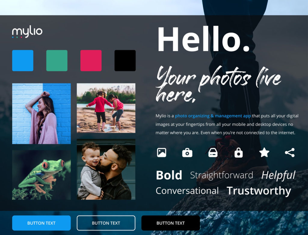
Bold brand colors
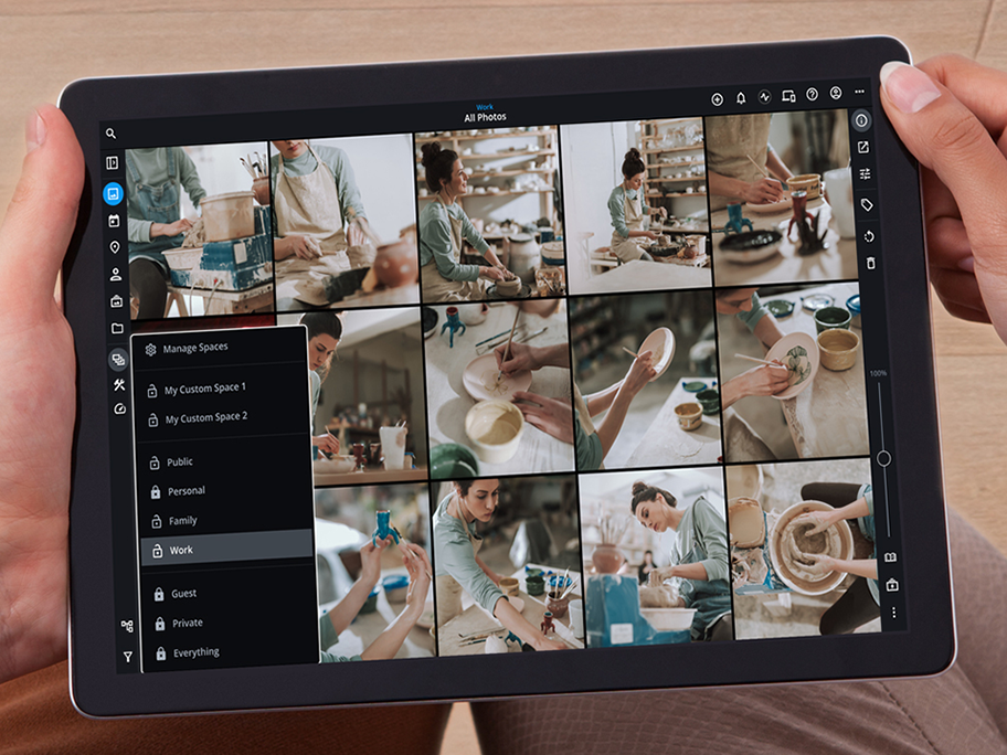
If you’re using Mylio, you generally see primarily black — a dark, bold contrast we believe sets off your colorful photos to advantage.
Our primary, secondary, and tertiary colors are based on the primary colors of light used in digital design and photo editing: red, green, and blue — aka RGB. Not surprisingly, we also found inspiration in the classic, photo-centric logos of Polaroid and Instagram.
Simple, clear logo
Like so many things, adding the “X” to our original logo seemed a good idea at the time. Later, of course, we realized it wasn’t the right fit. Were we MylioX? Or, was it Mylio + the Roman numeral for ten? Um, no on both counts.
Our bold new logo features three bright dots in our three primary brand colors lined up along the bottom of the lower-case letter m, which just happens to have three “legs.” We hope you like the new logo as much as we do.
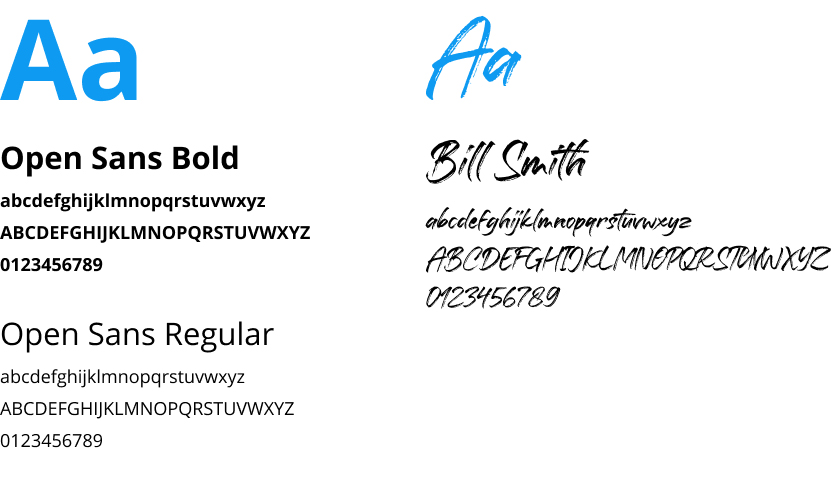
Fresh fonts
Although most of you may not have noticed, we have to admit we were all over the map with typography in the past. Varying fonts could be seen across operating systems and our website.
We’ve now landed on our favorite fonts that we will use exclusively: Open Sans, with Bill Smith for any details designed to look hand-written. Both are very clearly legible and meet all accessibility requirements. We hope your eyes will be happier as you manage your photos in the app or visit our website.
If you’ve read this far, thank you and congratulations. You now know way more than anyone needs to know about Mylio’s brand look.
Ultimately, our motivation for the update was to create a more welcoming, accessible, and easy-to-navigate home for you — and your photos, videos, and documents. The whole Mylio team thanks you for being part of our community.

Heath Huffman is a UX leader, visual designer, and creative technologist who loves solving business problems and delighting users with his work. He first became intrigued with the user experience while designing and coding complex websites and apps for corporations. He has now embraced it as his primary passion.